Building the Brand Identity for Rate4DiWin

At Opecson Signature Enterprise, we love bringing ideas to life through strong, meaningful brand identities. One of our recent projects was helping Rate4DiWin, a rising platform designed to help people choose the right restaurant, eatery, or fast food spot based on real reviews from other customers.
The goal was to create a brand identity that is fresh, trustworthy, and community-driven, reflecting the platform’s mission of guiding people toward the best food experiences.
The Logo Design
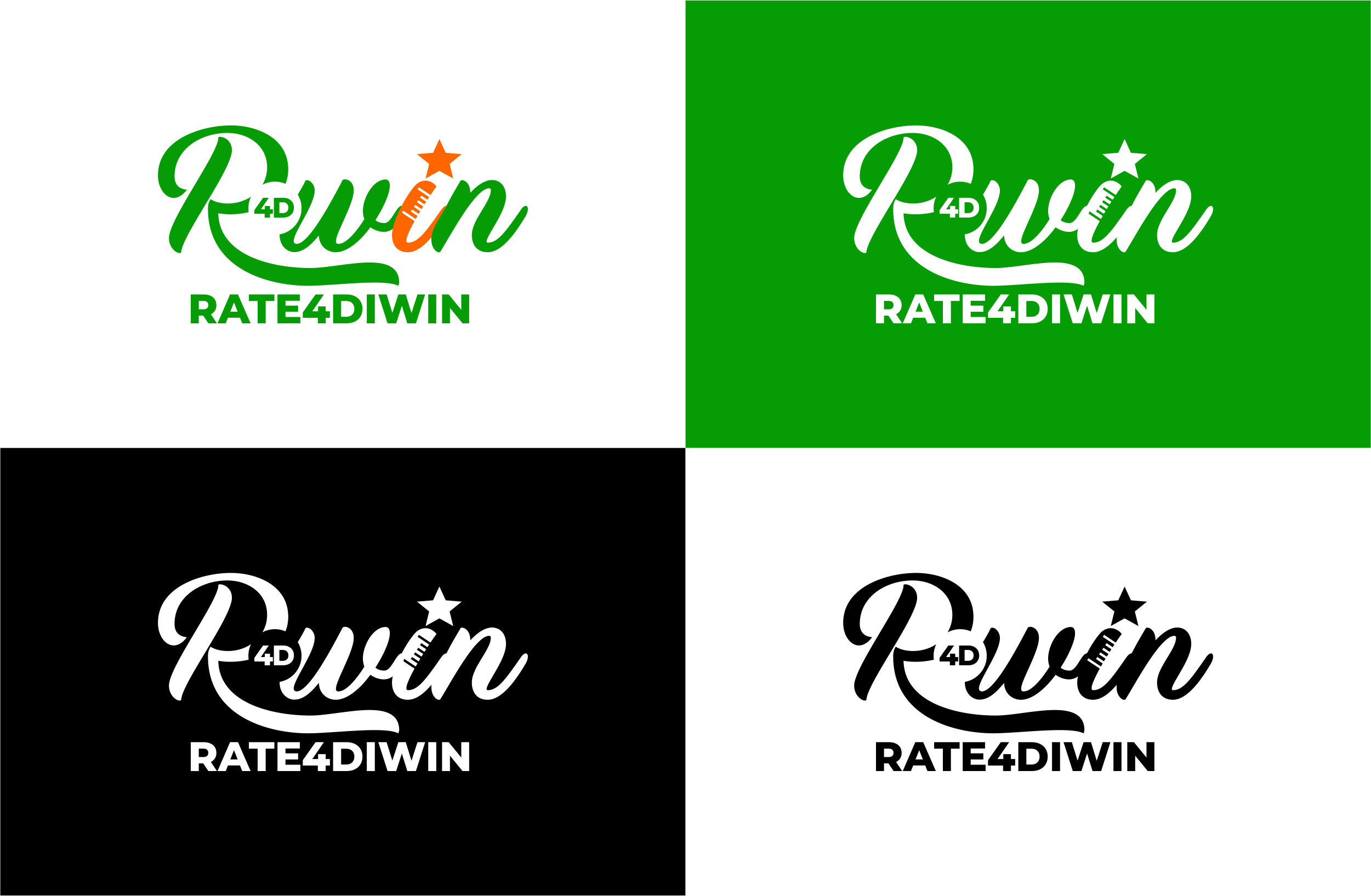
The Rate4DiWin logo is built around a clean and modern wordmark, where the word “Win” stands out as a symbol of satisfaction and achievement. Within the logo, you’ll notice:
The Star – A universal symbol of ratings and reviews, reinforcing the idea that users make choices based on others’ experiences.
4D – Seamlessly integrated into the design, it highlights the brand name and creates a sense of identity and uniqueness.
Curved Script Font – We chose Monday Miracle Alternate for the brand mark. Its flowing, approachable style communicates friendliness, warmth, and inclusiveness, while balancing professionalism with a community feel.
Together, these elements create a logo that is simple yet memorable, easy to recognize, and versatile across platforms.
The Color Palette
Colors play a big role in how people perceive a brand, so we carefully selected colors that align with Rate4DiWin’s values:
Green (#059C05) – The dominant color of the brand, symbolizing freshness, growth, and trust. It instantly connects with the food industry while also inspiring feelings of reliability and health.
Orange (#FF6600) – A vibrant accent that conveys energy, excitement, and appetite. It adds warmth and balance to the overall identity while sparking enthusiasm around food choices.
White (#FFFFFF) – Represents simplicity, clarity, and honesty. It provides contrast, ensuring that the logo remains clean and easy to use across multiple backgrounds.
This palette ensures flexibility for use on digital platforms, print materials, and even branded merchandise.
Typography
For supporting text, we selected Montserrat Semibold. This typeface is modern, clear, and highly legible, making it ideal for both digital and print use. Its geometric style conveys stability and professionalism, complementing the friendliness of the logo font.
Brand Application
The versatility of the brand identity allows Rate4DiWin to stand out whether on digital platforms, merchandise like t-shirts, or marketing collateral. The logo works beautifully in multiple variations – green, white, and black backgrounds – ensuring it remains adaptable while still retaining its core identity.
Conclusion
With its thoughtful logo, vibrant colour palette, and clear typography, the Rate4DiWin brand identity communicates trust, community, and vibrancy. It reflects the company’s mission to help people make informed choices about where to eat, guided by the honest reviews of others.
At Opecson Signature, we’re excited to have been part of Rate4DiWin’s journey, and we can’t wait to see how this brand grows and impacts the food community.